
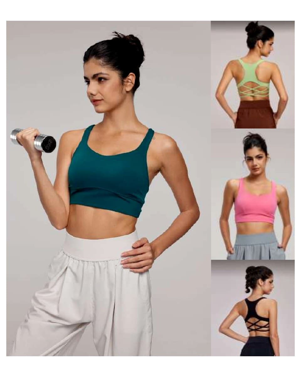
How should a brand plan turquoise workout wear?
Turquoise workout wear should begin with an exact blue-green reference, a named product role, and a sample question rather than a broad request for “turquoise.” Define the physical standard, companion colours, fabric surface, trim, logo, labels, packing, and the product that must prove the direction first. A selected catalogue style can frame a private-label discussion; a new fit, material, construction, colour relationship, or controlled sample plan belongs in factory-custom development.
For a wearer, turquoise can connect an outdoor, studio, workout, and everyday active-lifestyle mood. For a buyer, that apparent flexibility creates a risk: turquoise may lean blue, green, aqua, teal, mint, or deep blue-green depending on the source image, fibre, knit, stretch, lining, lighting, and nearby components. A catalogue photograph can help identify a silhouette, but it cannot establish an exact colour, fabric, logo method, availability, price, MOQ, or production condition.
The useful question is not whether turquoise is a good colour in the abstract. It is which product should carry it, what it needs to sit beside, which material and components can express it, and what evidence the first sample must provide. A turquoise bra with a charcoal short, an aqua short with a white top, and a dark range with a small blue-green logo are different product systems. State the intended one before asking a supplier to recommend a route.
The activewear design trends guide explains how visual direction can become a product and sampling plan. This guide focuses on the blue-green decision itself: how can a brand translate a turquoise mood into a reviewable B2B brief without treating an adjacent product colour or a digital swatch as production approval?
Why does turquoise need a physical reference instead of a colour name?
Turquoise is a family label, not a single production value. One team may picture a bright aqua; another may expect a muted blue-green; a third may mean a cooler teal. These directions can sit close together on a screen and still look clearly different on garments. A physical swatch, recognised standard, labelled working cut, or prior approved sample makes the desired direction visible to the buyer, designer, material team, and factory.
The brief should also say where the reference applies. A blue-green body fabric, mesh panel, rib, lining, elastic, binding, zipper tape, thread, transfer logo, embroidery, woven label, and printed hangtag do not take colour in the same way. A sample can show whether they look intentionally related, but a name alone cannot tell a factory which relationship must be matched closely and which contrast is acceptable.
This protects the buyer from a common scope problem. A product image may suggest a useful bra, short, or layer shape, while the actual project needs a different shade, fabric, component set, branding method, or construction. Mark the image as a product reference, name the desired colour source separately, and write the first review question. That leaves room for a supplier to explain the appropriate private-label or factory-custom path rather than guessing from a mood board.
Which product role should turquoise hold in a workout collection?
Assign turquoise a role before spreading it across the range. It can be a hero body colour on one selected bra, short, top, or coordinated set. It can be a supporting product beside a dark or neutral core. It can be a controlled detail on a panel, underband, logo, label, or packing element. The right role depends on the target customer, activity, sales channel, existing product system, and the visual question the capsule is trying to answer.
| Turquoise role | Useful application | What the buyer should define | First review question |
|---|---|---|---|
| Hero body colour | Bra, tank, tee, high-waist short, legging, or focused set | Exact standard, fabric, product use, companion product, and logo contrast | Does the selected turquoise have the intended depth and energy on the actual garment? |
| Supporting product | One studio top, workout short, light layer, or seasonal capsule item | Relationship to the core colour and whether it is a launch or repeat direction | Does it reinforce the range without competing with the core product? |
| Controlled detail | Binding, panel, strap, underband, drawcord, zipper zone, small print, or mark | Placement, component material, scale, and match versus contrast requirement | Is the blue-green detail readable and controlled at real size? |
| Presentation colour | Hangtag, label, bag insert, carton mark, or campaign guide | What is only a print decision and what needs garment-colour approval | Does presentation support the capsule without being mistaken for a fabric standard? |
The Yoga Activewear Catalog can help choose the product family before the colour is finalised. The I-Back Hollow Support Bra is a useful starting reference for a back construction, close-fit body, logo zone, label, and colour-review conversation. The Cooling High-Waist Sport Short can help a buyer name a lower-body silhouette, waistband, pocket detail, companion top, and intended colour role. These pages are not proof that a pictured blue, green, or other shade is an exact turquoise option for another project.
How can turquoise connect outdoor, studio, and lifestyle product stories?
Turquoise can shift its meaning with the surrounding products. Beside deep navy, slate, or charcoal, it can feel more technical or outdoor-led. Beside white, cream, or light grey, it may feel cleaner and more studio-ready. With a warmer accent, it can become more expressive and graphic. None of those combinations is automatic. A buyer should decide which customer context matters and whether the colour belongs on a core item, a seasonal hero, or a limited detail.
An outdoor-oriented direction may use a deeper blue-green on a light layer, a running short, or a small trim reference, with darker companions that make the bright colour easier to control. A studio or Pilates direction may place a softer turquoise on a bra, tank, or short with a light neutral. An everyday active-lifestyle direction may reserve turquoise for a small visual signal on a practical core product. These design options describe product relationships, not a promise about sports performance or a claim that any image proves a retail-ready option.
| Companion direction | Possible collection effect | Review risk | Decision to record |
|---|---|---|---|
| Turquoise + navy or charcoal | A more defined outdoor or training contrast | Dark components can make the blue-green look brighter or cooler | Core product, turquoise placement, and logo legibility on each surface |
| Turquoise + white, cream, or light grey | A clean studio or warm-weather combination | Light components need material, coverage, and packing review where relevant | Intended light reference, lining or component role, and brand-mark contrast |
| Turquoise + black | A sharper gym-wear or graphic direction | Small logos and panels can appear stronger than expected | Proportion, component material, and whether contrast should be subtle or prominent |
| Turquoise + warm accent | A controlled seasonal print, binding, or presentation cue | Two strong colours can disrupt the hierarchy | Accent scale, artwork version, placement, and sample objective |
The activewear colour approval guide is the next resource when a visual pairing must become a record of fabric, trim, logo, label, and sample decisions. It is more useful than asking a supplier to make turquoise look “the same” across unrelated materials without a reference and an approval boundary.
How do material, stretch, and components change a turquoise colour?
Turquoise can change visibly when the surface changes. Smooth stretch knit, rib, mesh, brushed material, woven shell, lining, elastic, binding, zipper tape, thread, transfer print, embroidery, and woven labels all reflect light differently. A close-fit bra or short can also make the colour look different under stretch. That is why colour needs to be reviewed beside material and construction, not in a separate digital palette only.
| Review point | Why it matters | What belongs in the first review |
|---|---|---|
| Body fabric | Fibre, density, stretch, and surface can change brightness and blue-green depth | Physical reference, target handfeel, product role, and the relevant wear or stretch question |
| Mesh, rib, lining, or panel | Construction can make the same standard look lighter, darker, or more textured | Placement drawing and whether a match or intentional contrast is expected |
| Elastic, binding, zipper tape, and thread | Small edges may create the strongest visible break in a colourway | Component material, expected match level, and scale at the real garment location |
| Logo, print, and embroidery | Artwork method and background determine readability | Correct artwork, placement, contrast, and proof owner |
| Labels and packing | Printed turquoise can support the brand without approving a garment body | Separate garment, label, hangtag, bag, insert, and carton proof decisions |
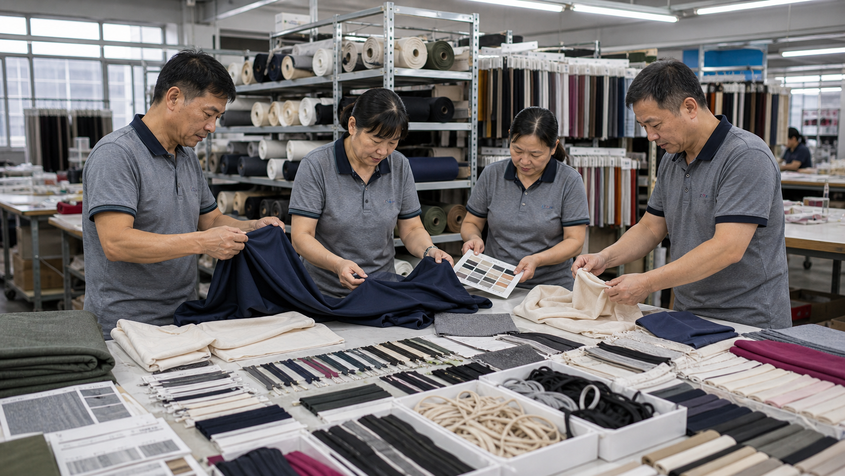
The review above helps a buyer bring fabric, trims, product direction, and colour references into one conversation. It does not mean a photographed material room or product image establishes a universal turquoise match. The buyer still needs to name the selected material, product, components, logo method, and the question the sample must answer. The fabrics and trims resource helps prepare that practical vocabulary.
When should turquoise use private label and when should it use factory-custom development?
The colour does not decide the commercial route. A catalogue-informed private-label project can suit a buyer who has selected a product direction and mainly needs a turquoise presentation, logo, labels, hangtags, packing, and quantity context. The private-label activewear service is a useful starting point for those branded details. Actual product, material, colour, branding method, packing, and commercial terms still require project confirmation.
Factory-custom development is more suitable when the buyer needs a new fit, fabric, panel layout, lining, construction, support direction, artwork, component relationship, special colour development, or controlled sample plan. A new blue-green mesh placement, a changed bra back, a custom print, or an outdoor-to-studio capsule with a new product architecture is more than branded presentation of a catalogue reference. The custom activewear development route is the appropriate route for that scope.
State the boundary early. Identify what the product reference helps describe, what must change, what remains unknown, and which evidence will decide the next step. That lets an activewear manufacturer provide useful feedback without turning a broad colour preference into an unapproved production specification.
How can a turquoise capsule stay coherent across outdoor, studio, and lifestyle products?
A flexible colour story does not require one garment to perform every role. It requires the brand to decide which products belong to each context and what connects them. An outdoor-oriented turquoise layer may share a colour family with a studio bra or workout short without using an identical material or component system. A lifestyle tee may carry only a small blue-green mark while a training short becomes the main colour statement. The collection feels connected when the product roles, colour hierarchy, and approval records are intentional.
Begin with a short capsule map. List the hero product, the stable core product, one supporting product, and any visual detail that carries the blue-green direction. Name the intended use for each: gym session, studio class, outdoor training, commute, or everyday layer. Then identify which relationships the customer will actually see. A turquoise bra might be paired with a charcoal short; a turquoise short may sit under a neutral layer; a dark tee may use the colour only as a small print. This makes it easier to choose the first sample and prevents a team from creating unrelated “turquoise” items that do not read as one range.
Use a separate approval line for garment and presentation. Garment approval covers the physical colour reference, body fabric, mesh, lining, binding, elastic, zipper tape, logo method, and construction. Presentation approval covers the artwork version, label copy, hangtag, bag, insert, barcode label, carton mark, and any campaign or e-commerce imagery. A blue-green hangtag can help a capsule look coherent, but it does not approve a blue-green bra or short. Keeping these records separate avoids a late-stage misunderstanding between printed materials and garment components.
This discipline is also useful before a repeat or replenishment discussion. Keep the selected product reference, physical turquoise standard, material direction, artwork version, logo method, label copy, packing instruction, and approved-sample notes together. The record is not a guarantee that future material, component, price, MOQ, or timing conditions stay unchanged. It gives the buyer and supplier a clear starting point to compare what is unchanged and what requires a fresh colour, component, or sample review.
The activewear manufacturing workflow explains where material confirmation, sampling, production, QC, packing, and export preparation sit in a B2B project. The activewear sample-to-bulk production guide can help the team carry approved details into the production package. Use both as process references, not as a shortcut around project-specific product, material, quantity, and approval confirmation.
How should logo, labels, and packing support a turquoise direction?
Turquoise can appear on the garment, but it can also support brand recognition through a logo, woven label, hangtag, bag insert, carton mark, or digital product guide. The buyer should decide which location carries the strongest signal and which details stay dark, light, neutral, or tonal. A small blue-green logo may work on a charcoal body, while a turquoise garment may need a deeper or lighter logo for legibility. The correct choice depends on surface, stretch, artwork, method, placement, scale, and product role.
Keep the garment colour, logo colour, label design, and packing directions connected but distinct. A turquoise hangtag does not confirm that a garment body is the same shade. A tonal logo may be appropriate for a studio piece but disappear on a textured surface. A high-contrast mark may help a workout product feel graphic but take attention away from the intended colour hierarchy. These are not universal rules; they are decisions the buyer needs to make visible in the brief and proof process.
For a private-label route, send the selected product URL, physical colour reference, companion colours, correct artwork file, placement, logo method, label copy, care information, hangtag layout, barcode data, bag, folding, carton marks, preliminary size plan, and quantity context. For factory-custom development, add the changes to fit, material, panel, construction, lining, artwork, or component relationship. This gives the factory enough context to distinguish a presentation request from a deeper development scope.
If one element has not been defined, mark it open rather than allowing the image to make the choice. The first sample may need to answer a garment-colour question, while a printed proof answers a packing question. Treating them as separate evidence keeps review comments precise and makes the next development step easier to discuss.
What should the first turquoise sample prove?
The first sample should answer one written question. It might prove how turquoise reads on the selected bra or short fabric, whether a blue-green body and dark binding look intentional, whether a logo remains legible, whether a lighter companion product supports the intended capsule, or whether a label and hangtag work with the garment direction. Name the approval owner and the change that would require another material, colour, artwork, or construction review.
inPACE can coordinate sampling support that may include printing, embroidery, wash effects, and other appropriate project steps. As a usual planning guide, samples often take 5–10 days and production often takes 25–50 days after scope and approvals are confirmed. Actual timing depends on style complexity, material availability, colourways, decoration, labels, packing, quantities, revisions, and production scheduling, so it must be confirmed for the project.
Keep the physical reference, fabric direction, component notes, artwork version, sample comments, and decision record together. If turquoise reads too blue on one knit, too green on another, or too dull beside a darker companion, identify the material or component that created the change. This lets the next sample focus on a real decision instead of reopening every product in the capsule.
What should a buyer include in a turquoise workout-wear brief?
Use this checklist before asking a supplier for a route, quotation discussion, or sample plan:
- Name the target customer, activity, channel, and intended outdoor, studio, or lifestyle role.
- Provide a physical standard, recognised reference, labelled cut, or prior approved sample for the target turquoise.
- State which product carries the blue-green hero role and which products remain core or supporting colours.
- Identify companion navy, charcoal, black, white, grey, neutral, or accent references that matter to the range.
- Link catalogue references or provide sketches, samples, or technical information for factory-custom work.
- Define body fabric, mesh, lining, elastic, binding, zipper, thread, print, and label relationships.
- Mark where a component should match closely and where an intentional contrast is acceptable.
- Supply the correct logo or artwork file, placement, scale, method, and background relationship.
- Separate garment approval from labels, hangtags, bags, inserts, barcode labels, and carton marks.
- Include the size range, preliminary colour allocation, quantity context, destination market, and packing needs.
- Name the one question the first sample must answer and the person who will approve it.
- Record open decisions and revision boundaries before a bulk discussion begins.
The activewear size, color, and quantity planning guide can connect a colour story to product allocation and order context. It does not set a fixed MOQ, price, timing, or production commitment. Those conditions must be confirmed for the actual project.
How do sample charges and refunds work for one turquoise style?
As a general guideline, the sample charge is 1.5–3 times the corresponding bulk unit quotation, depending on the product and development scope. For one style, the stated refund schedule is 10% at 100 units, 30% at 300 units, 50% at 500 units, and 100% at 1,000 units. Confirm the quotation, sample scope, and applicable order conditions in writing because material, colour development, decoration, components, revisions, and construction can change what is included.
A turquoise project can require additional review when it uses more than one fabric, special trim, a custom print, or a new construction. Identify the exact style, material direction, colour and component questions, artwork, labels, packing, revision scope, and approval outcome instead of treating the sample fee as a generic product price. That gives the buyer and factory a clearer basis for the next step.
Ready to develop a turquoise workout-wear direction?
Send inPACE Sports the target customer, physical turquoise reference, product roles, companion colours, material and trim direction, logo and packing requirements, size and quantity context, and the exact question the first sample should answer. Send a turquoise workout-wear brief to confirm whether a catalogue-informed private-label route or factory-custom development is appropriate.
Product directions
Explore relevant activewear products
Use these product pages as practical references for your brief, then confirm materials, fit, customization, and production details through sampling.
Yoga Activewear Catalog
Use the catalog to identify a bra, top, short, bottom, or layer that can carry a blue-green direction before the exact turquoise reference, material, and sample question are confirmed.
View product directionI-Back Hollow Support Bra
Use this bra reference to discuss blue-green body fabric, back construction, logo position, labels, and the evidence a first colour sample should provide without treating a shown image as a precise turquoise option.
View product directionCooling High-Waist Sport Short
Use this short reference to name a lower-body role, waistband and pocket details, companion top, surface, and colour-review boundary before a private-label or factory-custom project is confirmed.
View product directionFAQ
Buyer questions
What does turquoise workout wear mean for a B2B brand?
For a B2B brand, turquoise workout wear is a colour-direction decision that needs defined product roles, a physical reference, companion colours, material and component review, branding, packing, sample evidence, and quantity context. A colour name or product image does not by itself approve fabric, trims, construction, or commercial conditions.
Is turquoise the same as blue green, aqua, teal, or mint in activewear production?
No. These names can describe nearby colour families, but they are not interchangeable production standards. Provide a physical swatch, recognised standard, labelled working cut, or prior approved sample and state how it applies to the intended body fabric, trim, logo, and garment components.
Can a catalogue style be used for turquoise private-label activewear?
A catalogue-informed private-label discussion can suit a selected silhouette that mainly needs turquoise direction, logo, labels, hangtags, packing, and quantity review. Actual product, material, colour, branding method, packing, and commercial conditions require project-specific confirmation.
When does a turquoise workout-wear project need factory-custom development?
Use factory-custom development when the project needs a new fit, fabric, lining, panel, construction, artwork, trim relationship, special colour development, or controlled sample plan. Share product roles, annotated references, material direction, component requirements, branding, sizes, and the first sample question.
How should a brand compare turquoise with navy, grey, black, or white?
Assign each colour a product or component role, provide physical references, and review their relationship on body fabric, mesh, lining, elastic, binding, logo method, labels, and packing. A digital palette can guide the conversation but does not replace a project sample or approval record.
How long do turquoise workout-wear samples and production take?
As a usual planning guide, samples often take 5–10 days and production often takes 25–50 days after scope and approvals are confirmed. Timing depends on style complexity, material availability, colourways, decoration, labels, packing, quantities, revisions, and production scheduling, so it must be confirmed for the project.
How does inPACE handle sample fees for one turquoise workout-wear style?
The general guideline is a sample charge of 1.5–3 times the corresponding bulk unit quotation, depending on the product and development scope. For one style, the stated refund schedule is 10% at 100 units, 30% at 300 units, 50% at 500 units, and 100% at 1,000 units. Confirm the quotation and applicable order conditions in writing.