
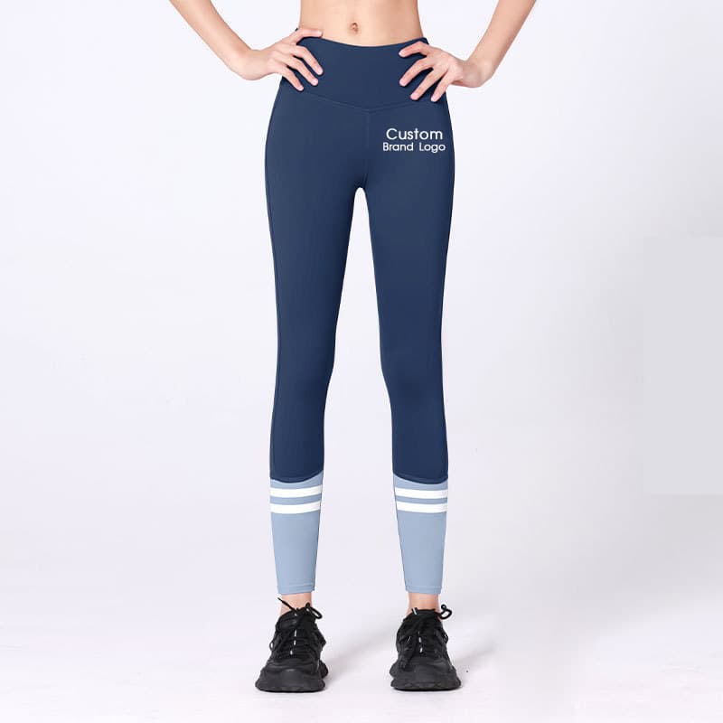
How should brands plan gym wear color combinations?
Gym wear color combinations should begin with a defined base colour, secondary colour, accent colour, product allocation, and sample question. A buyer should state which colours belong on the main garment body, panels, logo, labels, and packing, then review the actual material and components together. An existing catalogue silhouette can support a private-label discussion. A new colour relationship, fabric, fit, panel layout, construction, or controlled sample plan belongs in factory-custom development.
Orange–blue, orange–grey, green accents, black, white, and neutral companions can create very different gym-wear collections. A visual combination can help a brand set a direction, but it is not a production specification. The same colours may read differently on a smooth stretch knit, rib, mesh, brushed surface, light layer, lining, elastic, binding, zipper tape, printed logo, embroidery, label, or packaging insert. Product images are useful for naming garment roles. They do not confirm an exact colour, material, logo method, availability, price, MOQ, or production condition.
The buyer’s first decision is where each colour belongs and what the first sample needs to prove. A bright orange may work as a narrow side panel or logo area but overwhelm a full body. A grey legging can stabilise a more energetic top. A green accent might appear on one underband, binding, label, or packing element rather than throughout the collection. The right distribution depends on the target customer, activity, product family, material surface, brand hierarchy, and the evidence required for approval.
The activewear design trends guide explains how a visual direction becomes product roles, materials, samples, and a B2B route. This guide focuses on a narrower sourcing problem: how can a brand turn gym wear color combinations into a repeatable product and sample brief without treating a digital palette as finished production approval?
Why should a colour combination have base, secondary, and accent roles?
A colour list does not explain a collection. A hierarchy does. The base colour carries the largest visual area and gives the programme a stable foundation. The secondary colour supports it on another product, panel, layer, or component. The accent adds controlled energy through a smaller area, logo, trim, label, or presentation element. Each role should be named before a buyer asks the factory to make “a colourful gym set.”
Orange–blue can read athletic, graphic, or outdoor-oriented depending on which shade is dominant and where it is used. Orange–grey can balance brightness with a quieter core. Green can work as an accent beside navy, black, grey, white, or a neutral body, but its intended role needs the same discipline. These are useful design directions, not universal formulae. A physical standard and product review remain necessary for each project.
| Colour role | Range purpose | Useful product application | Buyer review question |
|---|---|---|---|
| Base | Creates the core visual field across the most important styles | Legging, short, bra, tee, jacket, or core set body | Which material, component, and product types must match this reference most closely? |
| Secondary | Supports the base and creates a visible product relationship | Companion top, contrast panel, layer, underband, or selected lower body | Does the secondary colour clarify the range without competing with the base? |
| Accent | Adds controlled emphasis at a small scale | Binding, stripe, zipper area, print, logo, label, or hangtag detail | Is the accent visible and intentional at the proposed material and product scale? |
| Presentation | Carries the hierarchy beyond the garment | Hangtag, bag insert, barcode label, carton mark, or digital style guide | Does this proof reinforce the range without being mistaken for fabric approval? |
The hierarchy should also state what is not required to match. A charcoal zipper tape may intentionally differ from a blue body. A white logo may be appropriate on one orange panel but not on a grey label. A green hangtag edge may support the range without requiring the garment elastic to be green. By separating intended contrast from required matching, the brief helps the factory and buyer review the correct decision.
How should a brand allocate colours across gym-wear products?
Start with product roles before assigning every colour to every style. A compact collection may use the base colour on a legging or short, the secondary colour on a bra or tee, and the accent only on a binding, print, or light layer. A larger range may give one product family a stronger orange role and another product family a stable blue or grey role. The buyer should explain which item is the visible hero, which item is the replenishment-oriented core, and which details are seasonal or launch-specific.
The Yoga Activewear Catalog helps a buyer identify product families before final colour approval. The Hooded Thumbhole Training Set is useful for discussing a training layer, body-panel relationship, sleeve and logo zone, and the colour evidence required from a first sample. The Basic High-Waist Lycra Short can help name a lower-body role, waistband relationship, companion top, and accent distribution. The Graphic Back Detail Set is a reference for discussing panel placement and a colour-block concept, not proof that a pictured colour, print, material, or configuration is available for another project.
Avoid making a range look coherent only in a flat layout. Put likely companion products next to each other in the sample brief. A buyer can ask whether the orange accent is used on the top, short, or jacket; whether blue is a core body or only a panel; whether grey is a neutral base or a supporting layer; and where green appears. This makes a collection decision visible in garment terms rather than only in a presentation deck.
How do fabric and components change a gym-wear colour combination?
The same reference can appear lighter, deeper, warmer, cooler, or more textured when its surface changes. Stretch, density, sheen, lighting, lining, mesh, rib, seams, panel placement, and nearby components all affect what the buyer sees. A colour plan should therefore name the intended body fabric and the connected components rather than assigning a colour name independently of the garment.
| Review point | Why it affects the combination | What the sample should show |
|---|---|---|
| Body fabric | Surface, density, stretch, and light can change each colour’s apparent depth | Target handfeel, movement use, physical references, and relevant stretch areas |
| Mesh, rib, panels, and seams | A secondary or accent can look more or less visible on a changed structure | Exact placement and whether the difference is intentional or needs revision |
| Lining and internal construction | It can change edges, contrast, and the context of a light or bright body | Location, interaction with the body material, and decision owner |
| Elastic, binding, zipper tape, and thread | Small components can shift the range from calm to graphic | Component materials, match level, contrast rule, and production placement |
| Logo and print | Artwork, method, background, and scale affect legibility | Correct artwork, intended contrast, placement, proof, and approval owner |
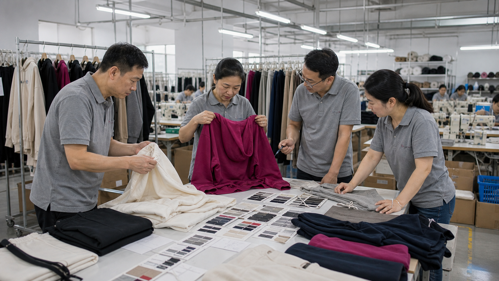
This kind of review gathers the body fabric, components, logo, and product role in the same conversation. It does not make a factory image or a screen palette into a universal approval. The buyer should specify the selected material direction, colour hierarchy, component notes, and one decision the first sample must support. The fabrics and trims resource can help prepare that material and component discussion.
How should orange–blue, orange–grey, and green accents be reviewed?
An orange–blue combination may need a decision about whether orange is a hero body, a stripe, a logo ground, or a small panel beside a blue core. An orange–grey programme may use grey to create a stable lower body and orange to direct attention to a top, trim, or logo. Green can be a third accent, a small seasonal signal, or a controlled detail that connects several styles. The appropriate option depends on the product, target wearer, sales channel, and brand hierarchy.
Use physical colour references where a relationship matters. State whether the body fabric, panel, binding, print, and label should match closely or create deliberate contrast. Check the relationship on the actual material at actual product scale. A digital orange may appear redder next to a blue panel. A grey can make a green accent appear cooler or warmer. A small white logo can disappear or become too dominant depending on the background and method. These are observations for a controlled sample review, not guarantees that one palette will behave the same way on every fabric.
The activewear color approval guide is the adjacent resource for documenting a colour decision across body fabric, trims, logo, labels, and samples. Use it when a team moves beyond inspiration and needs an approval record that survives a material, component, or artwork change.
When should gym wear color combinations use private label or factory custom development?
A catalogue-informed private-label route can fit when a buyer has selected an existing garment direction and mainly needs a confirmed colour hierarchy together with logo, labels, hangtags, packing, and quantity context. The private-label activewear service can help structure those presentation requirements. Actual product, material, colour, logo method, packing, and commercial terms remain subject to project-specific confirmation.
Factory-custom development is appropriate when the colour combination requires a new fit, fabric, panel map, construction, lining, special colour development, print, trim relationship, or controlled sample sequence. A buyer who wants a new orange panel shape, a changed blue mesh relationship, an added green binding, a different pocket construction, or a new logo ground is changing the physical product, not merely adding presentation to an existing reference. The custom activewear development route is the correct path for that deeper scope.
State the boundary early. Name what the product reference helps communicate, what must change, what is only a visual preference, and what the first sample needs to prove. This lets a supplier respond to the real project rather than assuming a colour-block image establishes a production-ready specification.
How can a colour system stay coherent across garments and packing?
Coherence does not mean every component shares the same three colours. It means the buyer records where each colour belongs and why. A legging, bra, tee, jacket, label, hangtag, bag insert, barcode, and carton mark may use different material and print systems while still belonging to one range. A short hierarchy record avoids using a collage as the only instruction.
List the garment roles first: hero product, core product, supporting layer, and seasonal or presentation item. Then list components: body fabric, lining, mesh, elastic, binding, thread, zipper, logo, and print. Finally list presentation items: labels, hangtags, bags, inserts, barcodes, and cartons. For each, state the base, secondary, or accent role and whether the relationship must match or intentionally contrast.
Keep garment and presentation approvals separate. An orange hangtag proof does not approve a top’s body fabric. A green bag insert does not confirm an elastic or logo colour. Record artwork version, label copy, packing requirement, proof owner, and approved sample comments beside the relevant product decision. This protects a range from late packaging feedback being mistaken for an unrecorded garment revision.
The activewear manufacturing workflow helps place colour, sample, production, QC, packing, and export-preparation decisions in sequence. The activewear sample-to-bulk production guide can help a buyer transfer an approved colour and component record into a bulk-production package without claiming that a prior photo automatically approves a new order.
How should buyers compare colour combinations before approving more styles?
Review a first colour-combination sample in the product context that matters to the collection rather than approving a flat colour card alone. Place the intended body material beside the working base, secondary, and accent references. Compare the garment with its lining, mesh, elastic, binding, thread, zipper tape, logo, label, and relevant packing proof. Then place it beside the products it will sit with in the capsule. The goal is to identify the observation that affects the next decision, not to declare every future style and component approved at once.
A close-fit bra or tee can make a panel relationship, neckline edge, logo scale, and contrast more visible. A short or legging can shift attention to the waistband, side seam, pocket, panel proportion, and relationship with a companion top. A lightweight layer can raise different questions about shell appearance, zipper tape, cuffs, lining, labels, folding, and presentation. One colour plan can connect these products, but each product role still needs its own sample evidence.
Use a short comparison record for the meeting. Include the physical base, secondary, and accent references; product image or sample; material direction; component notes; logo artwork version; packaging proof; and the name of the person who decides the next step. Ask the team to state one conclusion in plain language: continue with the selected relationship, adjust an accent area, test another component colour, revise artwork, or move the product into a more detailed factory-custom review. This is more useful than asking a factory to make a set look “more balanced.”
If a change is needed, identify whether it belongs to the colour reference, body fabric, component, logo method, artwork, placement, or product construction. A controlled note keeps a modest orange, blue, grey, or green adjustment from becoming an unfocused redesign. The next action may be a component proof, a revised colour sample, another garment sample, or a discussion about a changed factory-custom scope. The correct route depends on the real product change, not on the name of the palette.
How can a brand build a colour plan that supports later replenishment?
Brands often want a core colour system that can be extended across later products or buying periods. That is a reasonable planning aim, but it is not a promise that every material, component, colour, price, MOQ, or production condition will remain unchanged. A buyer should record what “core” means for the range and which details would trigger a fresh approval question.
Start with a simple style-and-colour map. Identify the core product, hero product, supporting layer, and presentation elements. Record the base, secondary, and accent role for each one. Attach the working physical references, material direction, component notes, logo artwork, label copy, packing requirements, and approved sample comments. This gives the buyer and supplier a practical way to distinguish an intended repeat from a revised colour, construction, or presentation project.
Separate the product question from the commercial question. The product question asks whether a specific garment, material, colour relationship, and branding treatment is approved. The commercial question asks what size allocation, quantity context, destination market, packing, and timing need to be discussed for a future order. Combining both as “repeat the orange-and-blue set” leaves too many details undefined. Keeping the two records connected but distinct gives each side a clearer starting point.
A later range extension may deliberately reuse only the colour hierarchy. A brand could keep navy as the base and orange as the accent while adding a grey training layer, changing a logo size, testing a green label, or introducing another product family. State the deliberate change and decide which physical or presentation evidence needs to be renewed. This lets a range feel coherent without suggesting that an earlier sample or image is a blanket approval for every later decision.
What should the first colour-combination sample prove?
The first sample should answer one written question. It may prove how the selected orange reads beside blue on the proposed fabric, whether grey creates the intended balance, whether green is visible at an accent scale, whether a logo contrast is clear, or whether a component relationship is deliberate. State who approves the result and what observation requires a material, colour, artwork, or construction revision.
inPACE can coordinate sampling support that may include printing, embroidery, wash effects, and other project-appropriate steps. As a usual planning guide, samples often take 5–10 days and production often takes 25–50 days after scope and approvals are confirmed. Actual timing depends on style complexity, material availability, colourways, decoration, labels, packing, quantities, revisions, and production scheduling, so it must be confirmed for the project.
What should a buyer include in a gym-wear colour-combination brief?
- Name the target customer, activity, channel, product roles, and collection purpose.
- Provide physical or standard references for each base, secondary, and accent colour.
- Identify which garments carry the largest colour areas and which components use controlled contrast.
- Link selected catalogue products or provide sketches, samples, and technical information for custom development.
- Define body fabric, lining, mesh, rib, elastic, binding, zipper, thread, print, and label relationships.
- Provide the correct logo or artwork, method, placement, scale, and background relationship.
- Separate garment approval from labels, hangtags, bags, inserts, barcodes, and carton marks.
- State size range, preliminary colour allocation, quantity context, destination market, and packing requirements.
- Identify the one question the first sample must answer and the approval owner.
The activewear size and colour quantity planning guide can help a buyer prepare the SKU and allocation discussion after the colour roles are defined. It does not set an MOQ, price, stock position, or production schedule.
How do sample charges and refunds work for one colour-combination style?
As a general guideline, the sample charge is 1.5–3 times the corresponding bulk unit quotation, depending on the product and development scope. For one style, the stated refund schedule is 10% at 100 units, 30% at 300 units, 50% at 500 units, and 100% at 1,000 units. Confirm the quotation, sample scope, and applicable order conditions in writing because material, colour development, decoration, components, revisions, and construction can change what is included.
Ready to develop gym wear color combinations?
Send inPACE Sports the three-level colour plan, product references, fabric and component directions, logo and packing requirements, size and quantity context, and the exact question the first sample should answer. Send a gym-wear colour-combination brief to discuss whether private-label presentation or factory-custom development fits the project.
Product directions
Explore relevant activewear products
Use these product pages as practical references for your brief, then confirm materials, fit, customization, and production details through sampling.
Yoga Activewear Catalog
Use the catalog to choose a top, bra, short, legging, or layer reference before assigning base, secondary, and accent colour roles.
View product directionHooded Thumbhole Training Set
Use this training-set reference to discuss a controlled colour-block relationship, logo zone, component contrast, and the first sample question.
View product directionPrivate Label Activewear
Use the private-label route when an existing garment direction mainly needs confirmed colour roles, logo, labels, hangtags, and packing.
View product directionFAQ
Buyer questions
What is the simplest way to plan gym wear color combinations?
Assign each colour a base, secondary, accent, or presentation role, then map that role to products, components, branding, and packing. Provide physical references and use a focused sample to review the proposed material, logo, trim, and garment relationship before a wider collection is approved.
Can orange and blue work in gym wear?
Orange and blue can be assigned to different product or component roles, such as a blue core with an orange panel, logo ground, or controlled trim. The buyer should provide physical references and review the intended relationship on actual materials and components rather than assuming a screen palette is production approval.
How should a brand use orange and grey gym wear?
A brand can use grey as a stable base or secondary colour and orange as a hero or controlled accent, depending on the product hierarchy. State the garment areas, logo contrast, components, and sample question, then review the relationship on the proposed materials and product scale.
Can a green accent work with a gym-wear collection?
Green can be a controlled accent in a base-and-secondary system when its role, product placement, component relationship, and contrast are defined. Review the actual green reference alongside the companion colours, body fabric, trims, logo, labels, and packing before approval.
When is private label suitable for a colour-combination project?
A catalogue-informed private-label discussion can suit a selected silhouette that mainly needs a confirmed colour hierarchy, logo, labels, hangtags, packing, and quantity context. Actual product, material, colour, branding method, packing, and commercial conditions require project-specific confirmation.
When does a colour-combination project need factory-custom development?
Use factory-custom development when the brief needs a new fit, fabric, panel layout, lining, construction, artwork, trim relationship, special colour development, or controlled sample plan. Share product roles, physical references, material direction, components, branding, sizes, and the first sample question.
How long do colour-combination samples and production take?
As a usual planning guide, samples often take 5–10 days and production often takes 25–50 days after scope and approvals are confirmed. Timing depends on style complexity, material availability, colourways, decoration, labels, packing, quantities, revisions, and production scheduling, so it must be confirmed for the project.